Web Design Perth
Leverage the Hidden Psychology of Your Customers to Skyrocket Your Conversions...
Blazing Fast, Mobile Ready, Conversion Optimised Web Design Perth

The harsh reality is that even the most exquisite Perth website design, with all the cutting edge bells and whistles won’t win you a single customer – unless it directly targets their underlying psychological motivations…
“Most Perth website designers focus on design and code but are clueless about the advanced marketing techniques that leverage psychological triggers to transform your website into a conversion generating machine”
- Have you got a website that struggles to convert anything more than a painfully slow trickle of leads?
- Maybe your website drives reasonable conversation rates but you struggle to generate enough targeted traffic?
- Or are you starting from scratch and need urgent assistance with a traffic and lead generating website?
At The Web Shop we approach web design from a marketing first perspective to ensure your website speaks to your clients at the deepest level and maximises the potential of your brand.
Web Design Perth Made Super Simple
Top Quality Affordability
Custom Tailored Payments
Stress-Free Process
Blazing Fast Turnaround
Plain English
Local Web Design Perth
Future Proof
The modular design of our platform, with tens of thousands of addons available to be integrated at any time ensures that your website can expand in scale and features as your business grows. The platform is constantly updated to evolve as technology develops, which means your website will never become out of date.
Lifetime Support
5-Star Google Reviews

Would not hesitate to recommend them to provide that professional finish to any project.

We had great experience working with Blair on our project. He is professional, patient and creative. We love the new website and are proud of it too.

Very helpful, swift responses and professional to deal with.

Excellent website design with great communication and a great overall experience.

Blair was easy to deal with and responded to many queries in a timely manner. Most importantly the end product provided was great!

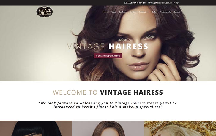
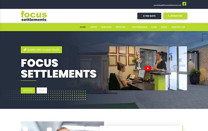
We recently utilised the services of The Web Shop to update our business website (Apple Settlements) and cannot thank Blair enough for his time and patience.

The Web Shop brings a polished professionalism with a clean creative approach. A real pleasure to work with and was thoroughly impressed with the finished result.

The website they built for me is working perfectly and it is showing me very high conversion rates.

Very happy with the end result. Blair listened to our requirements very carefully and delivered exactly what we had in mind from the outset.

Great job guys, thanks for all your patience and hard work on our new website!! Very good feedback from our clients so far.

I will definitely keep using their services as they never disappoint and always deliver.

Our website has just hit the top spot in Google for our main keyword and we are being swamped with enquiries and new customers!
Perth Web Design Inclusions
Ready to Skyrocket Your Conversions?
Designing Your Website Made Simple
Step 1: Define the Project Scope
Step 2: Website Mapping
Step 3: Website Wireframe
Step 4: Aesthetic Design
Step 5: Website Build
Step 6: Test
Step 7: Go Live
Zero-Risk Money-Back Guarantee!

100% Satisfaction or Your Money Back
We’re so confident you’ll love our services that we back them with our iron-clad 30 day, 100% money-back guarantee. If for any reason you’re not completely satisfied with your website - just let us know why so that we can improve our services - and we’ll issue a full refund!
Unlimited Support
At The Web Shop we backup every website we build with support services for the lifetime of your site!
We offer WordPress Maintenance Packages to keep your website loading fast and running smoothly, including;
- Advanced Speed Optimisation
- WordPress Core, Plugins & Theme Updates
- On and Off-Site Cloud Backups
- Hack Prevention & Security Measures
- Database Optimisation

Portfolio
Stunning Web Design Perth
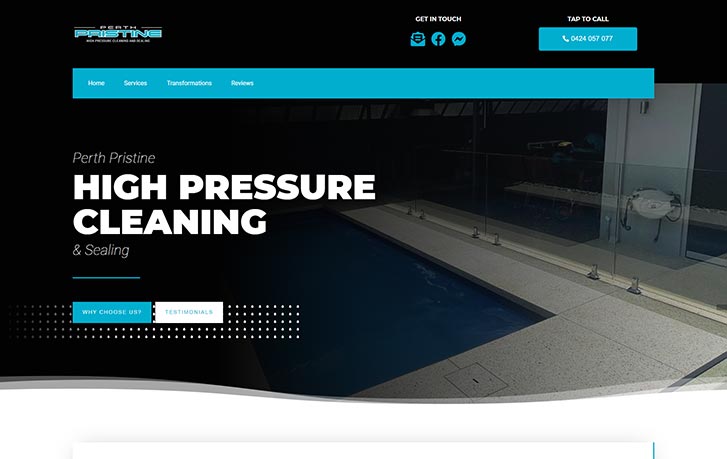
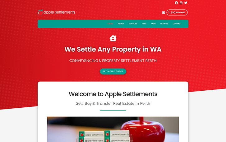
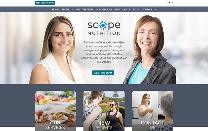

“Beautiful web design Perth to make your brand image shine”
- Bespoke design custom tailored to your brand
- Off-the-shelf templates never used
- Fresh, clean design style
- Mobile-ready design ensures elegant rendering on all devices & browsers
- Intuitive, user-friendly navigation
- Lightning quick loading
Web Design Perth FAQs
DO NOT EDIT!
How Much Will My Website Cost?
- Size – eg. The volume of pages or posts needed
- Functions – The features and functions required, such as online bookings, newsletter opt-ins, image galleries etc.
Why Are Your Rates Lower than Other Web Designers?
Why pay for someone else’s luxury?
Can I Organise a Custom Payment Schedule?
What Recurring Fees are Involved?
After launch maintenance, which ensures your website is updated and secure is industry standard practice. We advise you register for one of our WordPress Maintenance packages.
Will My Site Be Mobile-Ready?
How Quickly Will My Site Render?
Your website will integrate all the latest caching technology. Code and media will be compressed to give the quickest possible load speeds.
We also ensure your website is locally hosted on the fastest state-of-the-art servers available.
How Long Does the Design Process Take?
As an example, a standard site of around five pages, with basic functionality would be delivered within 2 weeks after receiving all your details.
How Can You Guarantee Satisfaction with the Finished Solution?
We’ll seek your approval after each stage and offer unlimited revisions.
You can make as many amendments as you wish to get the design looking exactly the way you imagined.
This way, we can guarantee you’ll love the finished result.
I'm Worried that I'm Not a Technical Person
We always communicate in non-technical language to make the development process stress-free and easy.
DO NOT EDIT!
Do You Utilise Pre-Designed Templates?
Every website we build is a bespoke, custom solution designed specifically to complement and enhance your brand image and suit the unique goals of your website.
Do You Employ Overseas Outsourcers?
Are You Located in Perth?
Do You Offer Lifetime Backup?
We guarantee to amend any errors on the website not caused by client misadventure for free.
We’re always be available to provide services such as content changes, design updates or implementation of additional features and functions.
We also provide WP Maintenance to ensure your site loading quickly, all core files, themes and plugins are up to date, and it is always backed up and safe from hackers.
Will I Be Locked into an Exlusive Platform?
Learn more about our WordPress web design Perth services.
How Simple is Updating My Website?
If you need more help we also offer WordPress CMS Training Sessions.
Do I Require Website Hosting?
Will I Own the IP & Copyright for My Website?
Will My Website be Optimised to be Indexed by Google?
- Advanced Speed Optimisation
- XML Site Map
- SEO Plugin (Yoast SEO)
- Meta Title Tags
- Meta Description Tags
- Proper Content Hierarchy
- Images Scaled and Compressed
- Image Tagging with Alt tags and Image Titles
- Best Practice Canonicalisation
The above listed provide the foundation for SEO indexing but in order to secure high visibility, especially in competitive niches, you’ll need to undertake an Search Engine Optimisation Campaign, which is a separate service to Web Design.
This involves a wide array of ‘Off-Page’ factors such as building your backlink profile and submitting your website to various online business directories etc.
Want to Dominate Google?
Web Design Perth Related Services

WP Design
Web Hosting
WordPress Maintenance
Domain Names
Search Engine Optimisation
SEO Copywriting
Speed Optimisation
Service Areas
Suburbs We Service Include
- Perth - Web Design Perth
- Alexander Heights
- Applecross
- Ascot
- Ashfield
- Balcatta
- Bayswater
- Beckenham
- Belmont
- Bibra Lake
- Booragoon
- Burswood
- Canning Vale
- Cannington
- Carine
- City Beach
- Claremont
- Clarkson
- Como
- Connolly
- Cottesloe
- Craigie
- Currambine
- Dayton
- Dianella
- Doubleview
- Duncraig
- East Perth
- Edgewater
- Ferndale
- Floreat
- Fremantle
- Golden Bay
- Greenmount
- Guildford
- Highgate
- Hillarys
- Innaloo
- Jandakot
- Joondalup - Web Design Joondalup
- Kallaroo
- Karrinyup
- Kewdale
- Lockridge
- Lynwood
- Mandurah
- Maylands
- Melville
- Morley
- Mosman Park
- Mount Lawley
- Mount Pleasant
- Munster
- Myaree
- Nedlands
- Noranda
- Northbridge
- Osborne Park - Web Design Osborne Park
- Ridgewood
- Rivervale
- Rockingham
- Scarborough
- South Perth - Web Design South Perth
- Subiaco - Web Design Subiaco
- Trigg
- Victoria Park
- Waikiki
- Welshpool
- West Perth
- Woodlands